Wednesday, December 7, 2016

Artwork Source will become Ignition Drawing

Its been a long time coming to add more personality to our business. We set out to relaunch our brand, with something more memorable and modern. 

What should you expect with the change?


• The only big things changing are our new logo and graphics.


• Our service staff, management and drawing ​teams will all be the same.


• 
Our low prices, high quality and 24 hour production time will be exactly the same.

• You can use your existing Artwork Source Username and Password. 


Check out our new logo and page designs!


How was Artwork Source originally chosen?


• When the business was started in 2003, we knew we wanted to do something that was not available anywhere, provide a vector service with 24 hour turnaround time.

• Survival doing the bare essentials took the majority of the time, while establishing a logo and company name were very low on the priority list.

• Artwork Source would show up early in the yellow pages which was a lot more important 15 years ago. 


Why are we changing to Ignition Drawing?

• Memorable names create a visual that connects the name and personality to the products. Generic names are easy to forget and do not stand out through the clutter of copycat competitors. Amazon beats books.com over time.


• Generic words have a meaning that is hard to change in the customers mind. Artwork Source doesn't speak to our specialties, our rockstar product managers, the huge effort we put into responsive friendly service, and our 100% reliability to deliver regardless of any behind the scenes challenges. 


We look forward to providing the same friendly service from the Pacific Northwest that you've come to expect!

Let us know what you think!


Wednesday, October 12, 2016

An introduction to Layout Lab tools

With Layout Lab creating a design only takes minutes, and saves time with your creative projects, without the need of expensive design software.  

Getting Started
Easy as 1-2-3
• Access our designer at layoutlab.net
• Click "Start Designing"
• Select a template and color, and you are ready to start designing


Creating text and adding effects is easy
• Click on the "Add text" button on the top left of the tool panel and type the desired text in the box 
• Select one of hundreds of available fonts
• Position, rotate and scale your text using your mouse
• Select effects like colors, outlines, curves and many others from our menu


Add cliparts or upload your own art
• Looking for a specific Clipart? Use the search bar to find it, or simply browse through our library
• We offer over 7500 Cliparts to choose from and include in your designs
• Upload your own art or drawing to have us vector
• Custom shapes library to aid you in creating new elements
• Ability to draw on the design


Customizing your design
You can scale, move, remove and change the colors of your art, at any point, with only a few simple clicks.


Other Features and Templates
Available at the click of a button on the left side of the art board:
• Include a template to show off your exact application
• Select part or the entire design, by drag clicking over the art board, in order to move or scale your art
• Zoom in or out to see details easily
• Turn on alignment grids in order to get maximum precision on your layout 
• Reorder layers to overlap elements correctly

Share your design with a customer or order production ready art once you're done!


Your Own Designer
Try out our Private Label feature. You will be able to send your customers, your own version of the designer so they can create and share designs with you, saving you time and generating more orders.

If you have any questions about Layout Lab, give us a call or send us an e-mail and we'll be happy to help make this a core feature of your business!

P: 253-284-0733
E: service@artworksource.com

Tuesday, September 27, 2016

How to use G-mail as a tool to view EPS/Ai/PDF files

Attachments have been used right from the early days of the email. Now-a-days people share more and more stuff online, rather than sending them through attachments. However it is still a part of many email users daily experience, since it is the easiest way to share a document or picture or anything else you want.

Attachment variety is at an all time high with more and more creative and utility programs populating the scene which raises a problem, in being able to see everything sent to you, without having to own several thousand dollars worth of software. 


The most common encountered problem in our field are EPS, Ai, and PDF files and Google has come up with a solution that allows you to see the files in your browser, just like a JPG, all by just using their e-mail service. All you need is to have your files sent to your Gmail address. If you do not have a Gmail address, simply set one up in a few minutes and forward any files you have trouble seeing in your other e-mail accounts.

 E-mail thumbnail view of attachments and full size opened Ai file in the browser.
This will also work with other common extensions like .doc and .tiff files, unfortunately it is not something currently available for Corel.

Tuesday, September 13, 2016

Survey Results

Thank you for participating in our customer satisfaction survey a few weeks back. Its important for us to know how we are doing, and how we can improve in the future, to better serve you. We really appreciate your feedback and would like to share our results with you!


Wednesday, August 31, 2016

Digitizing Landscapes

Approach is everything when you want to digitize realistically. In this and upcoming articles we will be discussing how to approach digitizing so your work comes out looking more realistic and dynamic.

Your typical landscape will often have the following: sky, mountains or hills, trees and a meadow or water. The first thing you want to consider is depth. The sky is behind everything, then the mountains, then the trees, etc. So first of all this will generally be the order of progression for you to digitize, but that alone will not give you the illusion of depth.

Over the years, I have noticed that vertical stitches have more loft than horizontal stitches. So in addition to the order preference, it is best to have a sky in which the fill is horizontal (left to right) and the mountains should be at an angle. The more the angle approaches vertical, the more loft it gets. So the closer to the foreground, the more vertical the stitch. What also creates realism is more detail the closer to the viewer.

This means trees in the background may just be a fill stitch, but in the foreground should show more detail like branches, groups or clumps of leaves and on occasion individual leaves. Satin stitch has more loft so take that into consideration also.

A row of pine trees can be done several ways. One way to approach this is to use a fill stitch going vertical or near vertical and having random pattern put to it. In Pulse use the fill stitch labeled Random. In Wilcom use the settings in Tatami and change the A pattern to .5 and the B pattern to 0. Add a percentage to Random of 15 to 80%. You can add even more depth by doing several rows of the same stitch fill, one on top another. A simple but impressive way is using satin stitch with Auto Split Stitch on (known as random split stitch in Pulse.) Feel free to turn it down from the standard 7 mm until the fill starts looking more like soft branches. I will be writing about trees more in depth in the near future.

On the left is the settings window for Pulse. In this window you can choose pre-programmed patterns. Above shows the settings for Random. On the right is the Object Properties panel for the ll stitch (Tatami). There are no pre-programmed settings for Tatami, but if you change the off set fraction to A: .5 and B: 0 and then change the Random factor to 60, you will get a very similar look. This pattern is excellent for trees or fur.

Water and ground should still look flat, even if it is in the foreground. Just a little bit of angle if you desire. Rivers that go on into the distance are best left horizontal stitches. Don’t be tempted to curve the angle of the stitch like you might do with the letter s, this will only give it loft and break that feeling of realism.

When doing reflections in water, I like to make the water and the reflections in the same direction and pattern, so the fill patterns match. This helps unify the reflection with the water. To give the reflection ripples, just add a jagged edge.

Mountains can be done rather majestically if you know a few tricks. First, focus on depth. Angle of stitch is important here. Keep your angle close to horizontal with the mountains in the background and more slightly higher angle with those in the foreground. If there are a range of mountains, you can break up the range in layers, either by changing the stitch direction or the stitch pattern. Look at the natural lines and ridges and imagine how they might progress inwards and that is your next mountain range.

With Mountains that have two obviously different sides, the key is to treat those two sides at opposite angles so one side does not look more in front of the other. Mountain caps are an entirely different thing. If possible, use fill stitch that is at a similar angle as the mountain it is going on. You don’t want the snow caps to look like they are sitting on top of the mountain, but part of them. If the snow parts are too small for fill stitch (generally I would not go below 5 mm for the width of the stitch), then use satin, but keep in mind that satin tends to look more lofty than fill stitch. Keep your density and underlay at a minimum.

As said earlier, sky should be in a fill stitch done horizontally. This direction also helps with blends. The sky is more often seen as being brighter above and fading in the horizon. A blend can be achieved more smoothly being digitized in the same direction. Wispy clouds should also be created in the same or close to same direction. Lighter clouds can be done in an open fill stitch with density being about half as much as normal. Cumulus clouds (the big pillowy ones) can break the rule about loft. Even though they are in the background, vertical or near vertical satin stitches with the split stitches turned on will give the clouds a nice puffiness. Just like the mountains, you can give the clouds more definition by treating the same cloud as separate parts and have billows overlap.

Above we see the basic layout of stitch directions. Below is the final result. Notice how the refection looks like
it is part
of the water rather than just a flipped image of the mountains and trees.
I will leave you with this, when digitizing, have a philosophy. Keep your stitch styles consistent. Perhaps keep one type of pattern for one kind of object (such as a mountains) and another different pattern or angle for the object next to it. Also, don’t use an obvious pattern when digitizing nature. If the fill pattern you use is too distinctive, it will look less realistic. That’s why I like to use random. It helps blur the pattern of your fill stitch.

Good luck and have fun!

Monday, August 22, 2016

Digitizing Trees, Leaves, Grass and Bushes

In a previous article, I showed how stitch direction and stitch type can be used in a creative way to make more realistic landscapes. Now we will focus more on individual areas, mainly trees, bushes and leaves.

A lot of designs that come around show thin outlines to create detail. That’s good for print, but not practical for embroidery. Try convincing your client to drop these outlines. When you have outlines, you are more likely to let the outlines do all the thinking for you, your designs are more likely to be flat and underwhelming. You should let stitch type and direction give you the detail. It may be just a little more work, but a great way to impress an important client.

The objects in this article are all left chest size images, not full backs. Although there are many different embroidery softwares, I will be primarily focusing on Wilcom.

Pine Trees (Conifers)

The main characteristic of Pine trees is that it is a needle bearing tree and does not have leaves. The branches of pine trees can be fairly easily created.

Fig. 1
Fig. 2


Fig 3
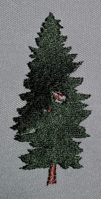
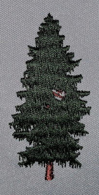
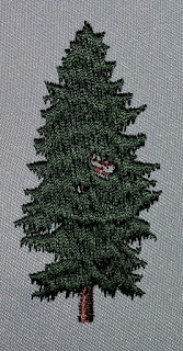
A row of pine trees can be done several ways. One way to approach this is to use a complex fill stitch going vertical or near vertical and having random pattern put to it. In Pulse use the fill stitch labeled Random. In Wilcom, you will have to go into the settings in Tatami and change the A pattern to .5 and the B pattern to 0. Add a percentage to Random of 15 to 80%.

You can add even more depth by dividing the clump of trees into several rows of the same stitch fill, one on top another. Another simple but impressive way is using satin stitch with Auto Split Stitch on (known as random split stitch in Pulse.) Feel free to turn it down from the standard 7 mm until the split sections look even with the bottom of the branches (Fig. 3).

On individual trees that are more of the focus of the design you may want to put more detail into it. First of all, even though you may see individual branches, never go crazy and try to duplicate each branch. It’s both too much work and too many stitches when dealing with overlapping of branches. Simulation of the branches is just fine. If the spacing between branches needs to be over 7 mm, I suggest switching from satin with a split stitch to Tatami with A pattern to 1 and B pattern to 0 and adjust the random and stitch length until the pattern starts lining up with the branches (Fig 2.) Add a jagged edge pointing downward and you will get a nice representation of the needles.

Leafy Trees (Deciduous)
Fig. 4 - Line art of a leafy tree

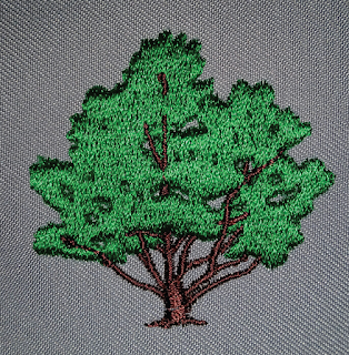
Fig. 5 - Standard Tatami fill stitch. Direction of fill stitch is almost vertical.
Wilcom Object Properties: Offset A: .25 Offset B: .25 Random: 0.
When digitizing trees, do not try to do individual leaves. Three simple techniques I can suggest:

1) Complex fill with Tatami stitch (Fig. 6) This can be quite boring, but if done right, can be a quick and effective way. First, the stitch direction should be more vertical. You go horizontal, and it will be flat and boring. For Pulse, choose the fill pattern labeled Random. For Wilcom, go into Object Properties and select Tatami fill. Change the offset to A: 0 B: 1.00 and turn random on 80. It will give a nice organic feel.
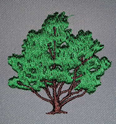
Fig. 6 - Tatami fill stitch with random applied. Direction of fill stitch is almost vertical.
Wilcom Object Properties: Offset A: .0 Offset B: 1.00 Random: 80
2) Find the pattern in the tree clumps, and simplify this into several groupings (Fig. 7). Play with the direction of each clumping and use satin stitching with split stitching enacted. The difficulty with this technique is making it look like one entire object and not just a bunch of clumps.
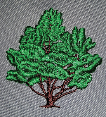
Fig. 7 - Tree has been divided into smaller groups of Satin stitch with split stitch applied, various angles.
Object Properties: Split stitch selected with a length of 5 mm.
3) Similar to #2, create clumps, but instead of using satin/split stitch, use Tatami fill with a nice random pattern (Fig 8.) With this technique, have all of the clumps go in a similar stitch direction. This will allow the clumps to be more unified but still be interesting.

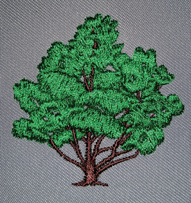
Fig. 8 - Combination of Fig. 6 and Fig. 7. Tree has been divided into smaller groups with similar Tatami fill as Fig. 6 with only slightly offset vertical direction. Wilcom Object Properties: Offset A: .5 Offset B: 1.00 Random: 80. 
Leaves

For your traditional leaf, create the division in the leaf by using two different stitch directions. Do the stitch direction in a herringbone style (Fig. 9.) Angle your stitches one way for one side of the leaf and the opposite for the other side of the leaf, overlapping slightly.

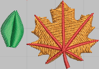
Fig. 9 - Different stitch direction makes for more interesting leaves. 

Grass

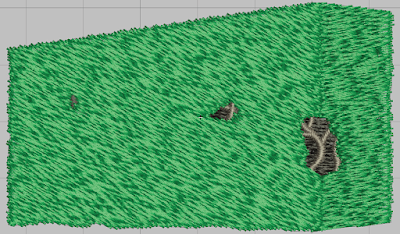
Although it is tempting do to every blade of grass in some designs, and you have nothing else to do, don’t do it. It might have more depth and characteristic by doing so, but you also get a problem of too many stitches in an area which usually makes the design dense and causes the design to warp. You may also get thread breaks. So my suggestion, is use a fill stitch for the majority of the area and then just suggest a few blades of grass on top of the fill with a satin stitch. Generally, you can even lower the density of the satin stitch since it will be green on green.

Hedges and Bushes

Generally, bushes and hedges can be approached the same way. I like to use a large percentage of random in my Tatami stitch and use an offset fraction of A: .5 and B: 1.00 and a random at around 80%. I also like to use a bit of jagged edge (both sides) of .6 mm. Just enough to give it a slight roughness. The direction should always be between an angle of 45 degrees to 90 degrees to give it loft (Fig. 10.) Just horizontal will make it flat and you want your bushes and hedges to stand out from the background.

Fig. 10 - Hedge showing randomized Tatami fill stitch with slight jagged edge on both sides. 
Have fun playing around with stitch type and pattern. The more you experiment, the more you will learn. Although putting the image on True View or 3D (Pulse) isn’t as good as an actual sew out, use it as a guide to give you an idea if your are close to getting what you want. Most of these techniques do not take much a lot more time than just flat embroidery, so go ahead and try. You and your customer will enjoy the outcome.

Tuesday, July 26, 2016

Embroidery Glossary Stitch Types


Run Stitch

  This is your basic stitch. This stitch is common in both embroidery and sewing machines. Look at the seam of most jeans and you will see this stitch. Most run stitches in embroidery are between .8 mm to 5 mm in length. The stitch length is regulated and can be made to be the same length for straight or curved stitches, or given a smaller minimum for curves. Run stitches are used for detail, traveling from point to point or for underlay.
aka: Walking Stitch

Double Run Stitch


The run stitch can also be doubled back up on itself and is called a double run stitch. If the inputs are staggered, the line will be less segmented. This stitch type is most often used for thin outlines.

Manual Stitch

This may appear to look like run stitch but it is unique in the stitch points are not regulated. In other words, you manually put in the stitch points, making an irregular looking run stitch.

Triple Run Stitch

This is like a run stitch but goes forward a stitch, back to the previous point then forward again and repeats itself for the next stitch. Triple Stitches are generally used for outlines when a run stitch is too thin and satin stitch is not an option.
aka: Bean Stitch

Satin Stitch

The most common of stitches. It is a tight zig-zag stitch that is most often used for borders and lettering. The density can be altered and end up looking similar to a zig-zag stitch.
aka: Column Stitch

Zig-zag Stitch

Very similar stitch to Satin Stitch, but more open between stitches with the end stitch always ending on the same side as the beginning stitch. This is often used for underlay and tack-down for appliques.

Stem Stitch

Just like Zig-zag stitch but at an angle. Used most for decorative stitching or borders.


Back Stitch

Similar to the Triple Stitch, but the stitching is at an angle and staggered. This can be used manually as an alternative underlay for Polar Fleece and Sweaters.

Fill Stitch

This is the stitch that you see for fills or wide areas. Fill stitch is a pattern that is created by a run stitch that goes back and forth really close together. The pattern can be changed. The density, distance from the edge, angle, pattern, and the edge of the stitch can all be changed. You may also see this stitch as a tackdown or underlay but with the spacing further apart.
aka: Tatami, Ceeding